

Dennison Bertram
Celkem 25 komentářů

05:47:18 03.01.2004
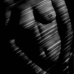
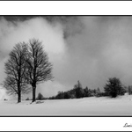
Je hezke, ale myslim ze to potrebuje nejaky silnjesi hlavni thema. (I think it needs a stronger central theme, but it's very nice, I like the color!).


01:33:25 31.12.2003
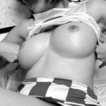
Je pekne. Libi se mi to thema. Myslim je to mholo by vic ostry, a contrast, ale velmi pekne a "tender".
00:02:04 31.12.2003
Krasny, mohlo by to mit trochu vic contrastu, proto je to shede. Ale libi se mi to.

16:27:19 30.12.2003
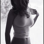
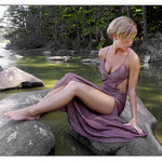
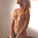
I like this picture, I think it would be better without the "absolut comfort" because it's such a nice picture that it works without words.
06:03:13 26.12.2003
This is nice, and very close to excellent. There is something missing, and I can't exactly explain what it is. Perhaps if the background was blurry. It needs something to seperate the model from the background, something to make her look more unearthly.
.
[evzen kalab]
04:49:44 26.12.2003
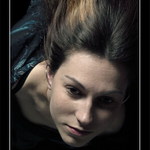
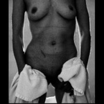
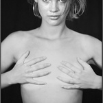
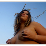
The light is strange aroung the models breasts, but the face is _beautiful_ really sharp (ostry) with great contrast.
04:37:08 26.12.2003
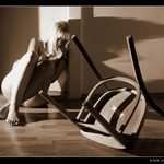
This is a nice photograph, although is sadness or depression is the goal, I think the light can be better utilized. Here it is much to bright to convey the sense of depression I think you are looking for. Perhaps more grey, something with less contrast. It would be nice to see the texture of her skin on her legs.
04:35:17 26.12.2003
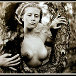
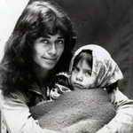
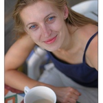
I like the angle. The picture has an element of humor that is very attractive. It feels more like a 'snapshot', because it's very light hearted and unposed. Nice.
04:22:16 26.12.2003
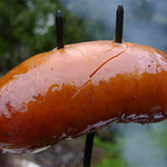
Lovely picture of a parek! (Are you trying to tell us something?) It's a nice combination of blues from the smoke, the greens and the red of the meat. All very muted, but bright at the same time. Not sure why it's in the 'akt' catagory. Anyway, I think it needs to cook a little longer.
04:20:22 26.12.2003
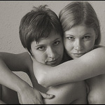
This photo needs work, but it's not terrible. The key here is to watch your lighting, (pozor na blesk) because it washes out too much behind her and throws off the balance. The model is fine, and so is the pose. Classical, but still fine. Try the photo again, but be more careful with your light source. Less is more.
04:13:47 26.12.2003
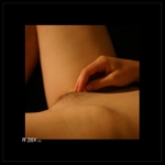
You know, I like this. It could use a little bit more contrast, but I think that is more the result of it being digital than anything else. Also, becaus she has such a lovely shape in her breasts, I would actually obsure the photo more. Make it harder to see, perhaps darker or blurry. Very nice though, I like it! Omluvam se, ale ja mluvim jenom trouchu cesky. Myslim ze tento fotky je velmi hesky. Muj nazor je ze to byl bych lepsi jestli to bylo tmavsi, vice 'contrat'. Ale libi se mi to! Super vyhlídka. To je original.