Další | Předchozí


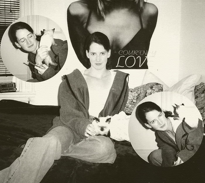
Fotografie: KT and Young Master Eng, 1996

Autor: Robert Gladstein | : - | POSLAT ZPRÁVU VLOŽIT AUTORA DO BOOKMARKU

Kategorie: portrét

Vloženo: 07:34:53 21.08.2003


Technická data:
Cheap 35mm, scanned into Photoshop, switched to greyscale and applied a few filters
Poznámky a vzkazy:
Popis:
Klíčová slova:
exif

Bodů: 83 (3.77)
Zobrazeno: 678x (29.48)

PROFIL AUTORAmilan toma | 00:51:56 05.06.2004 | : - | POSLAT ZPRÁVU VLOŽIT AUTORA DO BOOKMARKU

5

:) she is good and the cat as well

PROFIL AUTORAMarek Uhlíř | 13:44:27 22.03.2004 | : - | POSLAT ZPRÁVU VLOŽIT AUTORA DO BOOKMARKU

4

OK, circles?-good, but not circles better

PROFIL AUTORAJan Cihlář | 19:04:08 08.10.2003 | : - | POSLAT ZPRÁVU VLOŽIT AUTORA DO BOOKMARKU

3

PROFIL AUTORARadek Mánek | 06:36:30 17.09.2003 | : - | POSLAT ZPRÁVU VLOŽIT AUTORA DO BOOKMARKU

4

PROFIL AUTORARobert Gladstein | 18:43:31 30.08.2003 | : - | POSLAT ZPRÁVU VLOŽIT AUTORA DO BOOKMARKU

good question... it was an experiment, trying to match the look of some old portraits my mother had of her grandparents that were taken around 1910. when i applied the photoshop filters that gave it an old look, i had the idea of adding in the circles... it may have been a mistake.

PROFIL AUTORAPan Smazaný | 18:33:16 30.08.2003 | : - | POSLAT ZPRÁVU VLOŽIT AUTORA DO BOOKMARKU

3

It would be much better without these 2 circle-portraits. It would be greate! Why did you place them there?

PROFIL AUTORAjerry cmehil jr | 04:04:25 24.08.2003 | : - | POSLAT ZPRÁVU VLOŽIT AUTORA DO BOOKMARKU

3

nice compo - but quality could be better

PROFIL AUTORAfrancesco bac | 07:38:27 23.08.2003 | : - | POSLAT ZPRÁVU VLOŽIT AUTORA DO BOOKMARKU

5

PROFIL AUTORAMíla Zíval | 15:27:01 22.08.2003 | : - | POSLAT ZPRÁVU VLOŽIT AUTORA DO BOOKMARKU

4

PROFIL AUTORALukáš Hejtman | 07:41:35 22.08.2003 | : - | POSLAT ZPRÁVU VLOŽIT AUTORA DO BOOKMARKU

4

PROFIL AUTORAMarián Angelovič | 06:31:40 22.08.2003 | : - | POSLAT ZPRÁVU VLOŽIT AUTORA DO BOOKMARKU

4

PROFIL AUTORAJirka Vaňourek | 02:25:18 22.08.2003 | : - | POSLAT ZPRÁVU VLOŽIT AUTORA DO BOOKMARKU

4

PROFIL AUTORAKatka Schnablová | 21:49:40 21.08.2003 | : - | POSLAT ZPRÁVU VLOŽIT AUTORA DO BOOKMARKU

4

PROFIL AUTORASilke Klein | 11:53:23 21.08.2003 | : - | POSLAT ZPRÁVU VLOŽIT AUTORA DO BOOKMARKU

4

PROFIL AUTORADaniela Kodytková | 10:43:45 21.08.2003 | : - | POSLAT ZPRÁVU VLOŽIT AUTORA DO BOOKMARKU

4

PROFIL AUTORAJan Křečan | 09:36:15 21.08.2003 | : - | POSLAT ZPRÁVU VLOŽIT AUTORA DO BOOKMARKU

3

PROFIL AUTORAMartin "ELVIS" Baldinsky | 09:25:58 21.08.2003 | : - | POSLAT ZPRÁVU VLOŽIT AUTORA DO BOOKMARKU

3

o.k. idea, but too many white spots (for me) around and circles are really close to the edge.

PROFIL AUTORAPavol Munčák | 08:46:35 21.08.2003 | : - | POSLAT ZPRÁVU VLOŽIT AUTORA DO BOOKMARKU

4

PROFIL AUTORAJirka Klán | 08:31:13 21.08.2003 | : - | POSLAT ZPRÁVU VLOŽIT AUTORA DO BOOKMARKU

4

the poster is troublesome for me

PROFIL AUTORASnasin Sin | 08:08:24 21.08.2003 | : - | POSLAT ZPRÁVU VLOŽIT AUTORA DO BOOKMARKU

3

PROFIL AUTORADemeter Jurista | 07:57:48 21.08.2003 | : - | POSLAT ZPRÁVU VLOŽIT AUTORA DO BOOKMARKU

3

Yeah... But the small circles are too near to the left and right side, they are almost touching and it seems a bit strange to me... Go on...

PROFIL AUTORAPažout alias Mike Dockal | 07:49:01 21.08.2003 | : - | POSLAT ZPRÁVU VLOŽIT AUTORA DO BOOKMARKU

4

interesting ...

PROFIL AUTORAMartin Doležal | 07:46:12 21.08.2003 | : - | POSLAT ZPRÁVU VLOŽIT AUTORA DO BOOKMARKU

4

,,girl sweet , cats is too small , experiment good ..